Voice Content Management
There were a lot of exciting features to create during my time with Voicify. This case study captures one such project and outlines some of the steps along the way. My process has evolved and remains flexible for any particular challenge I’m presented with, but this example stresses the importance of user-centered design and how that concept is key to how I approach things.
Content was core to the Voicify platform so I was really thrilled to have the opportunity to improve this aspect of the product. There were so many things I had learned as the product took shape and this update allowed me to address a number of limitations and greatly improve how our customers were able to create and manage their content. This improved our user’s satisfaction with the product and opened the door for us to approach larger, enterprise-level customers including some of the biggest companies in the world.

Overview

Company
Voicify - Helps brands create, manage, and deploy experiences (apps) to third-party conversational platforms like Alexa and Google Assistant
Role
Founding/Senior Product Designer - Sole designer on team
Timeframe
Late 2019 - 2 Month Duration
Team
VP of Engineering, Director or Engineering, Senior Software Engineer
Summary
The Problem
The overarching goal of the platform is to enable users to build a conversational experience, even if they have no technical know-how or domain knowledge within the voice space.
With that goal in mind, how might we allow users to create, manage, and organize their content in a way that enables the swift and effective creation of a conversational experience?
Background - An Evolving Platform
When Voicify was launched the voice space was still very new and there wasn’t too much clarity on how brands would want to go about building an experience. I designed a platform that would lean on existing paradigms that our target audience was familiar with such as web forms and content management.
The goal was to make decisions based on limited research and quickly put together a platform that would likely fit user needs and make adjustments once we had customers to provide additional feedback.
This project came at just such an inflection point; we had customers with use cases we hadn’t initially anticipated and conversations with them showed that there were friction points within the platform that needed to be resolved.
Previous State
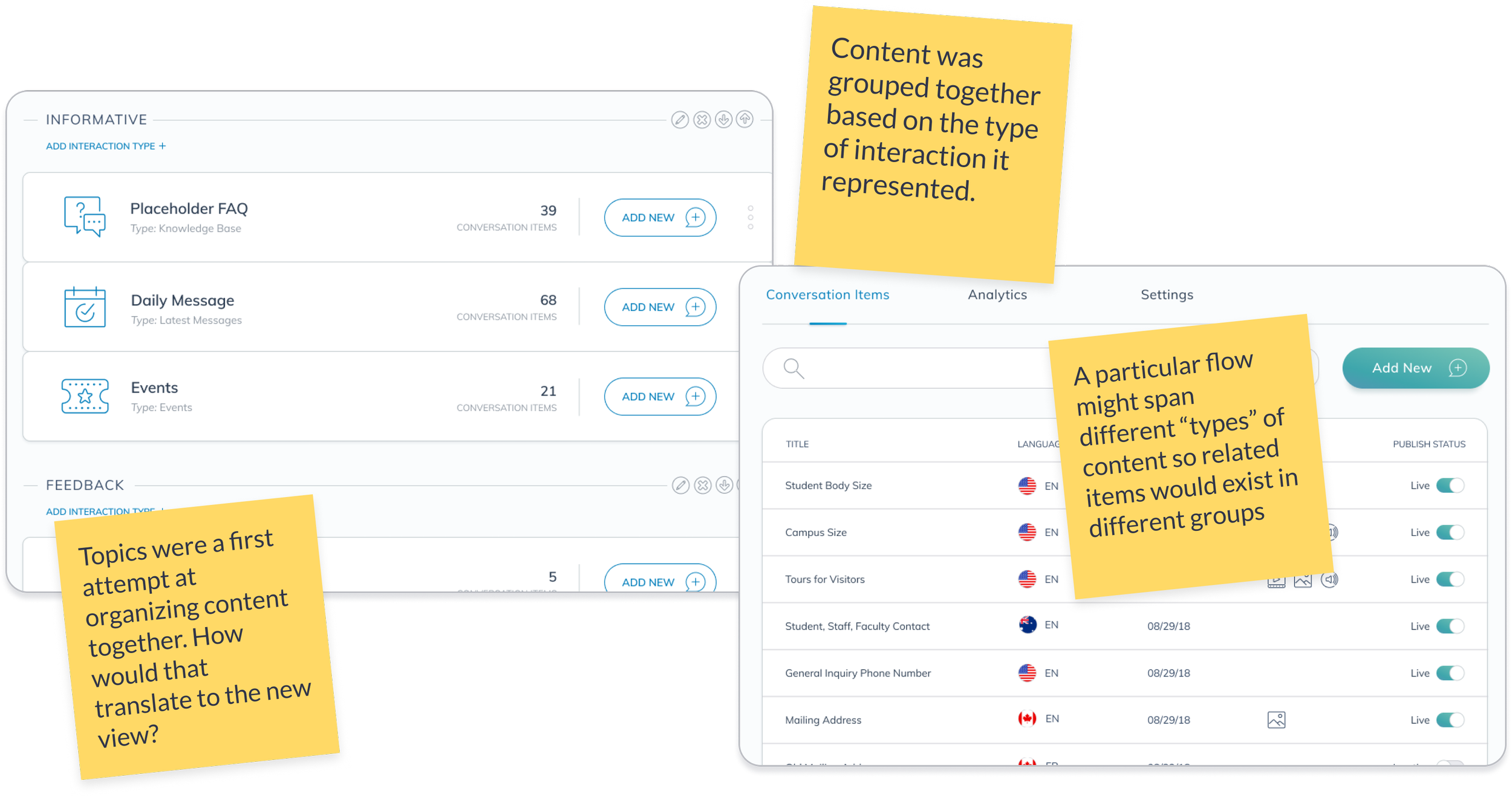
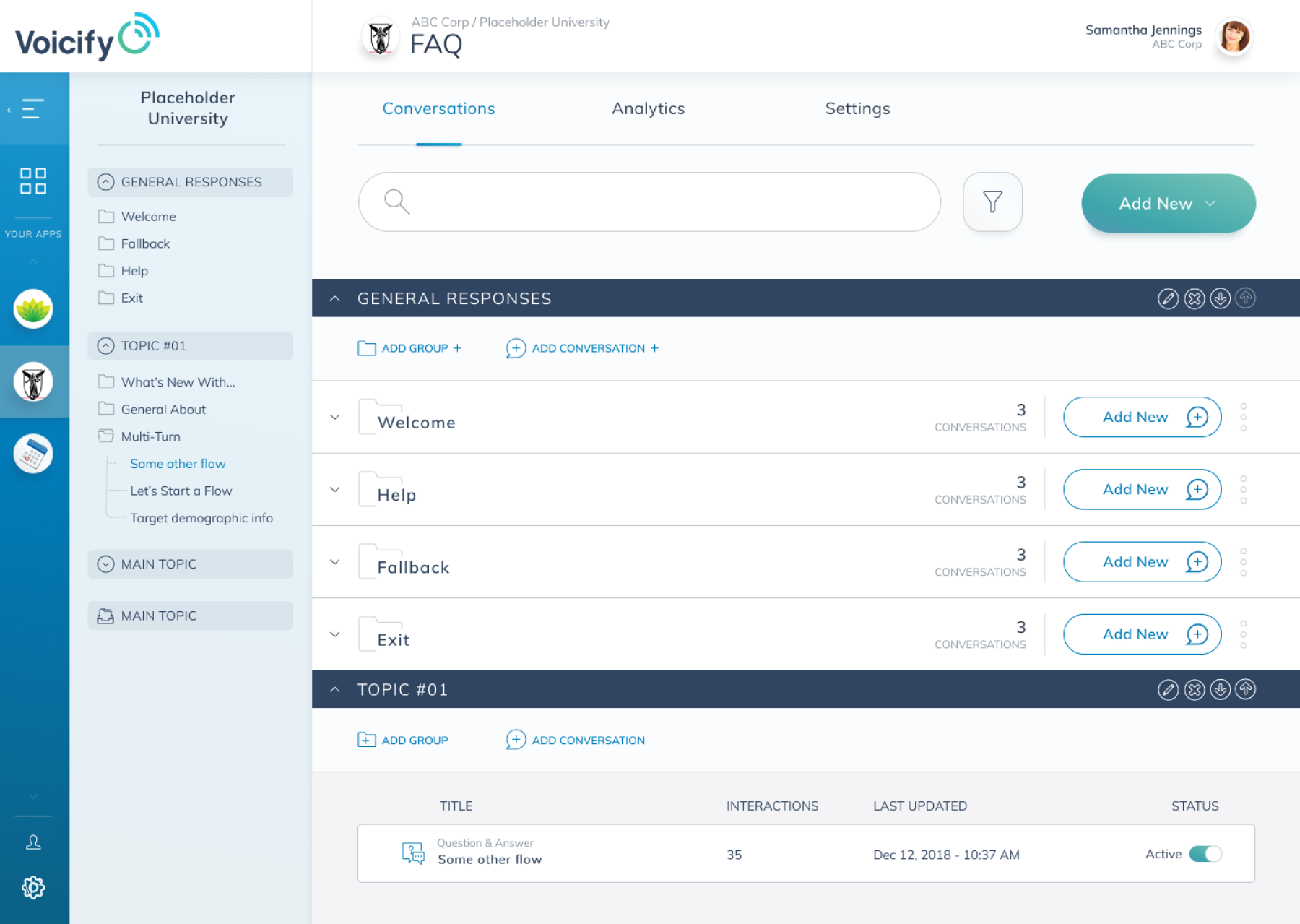
The initial interface had a structure that suited a content-forward approach. However, our interface was too opinionated on how that content should be organized (by type). It lacked some of the features and nuances common to many Content Management Systems.
Solution
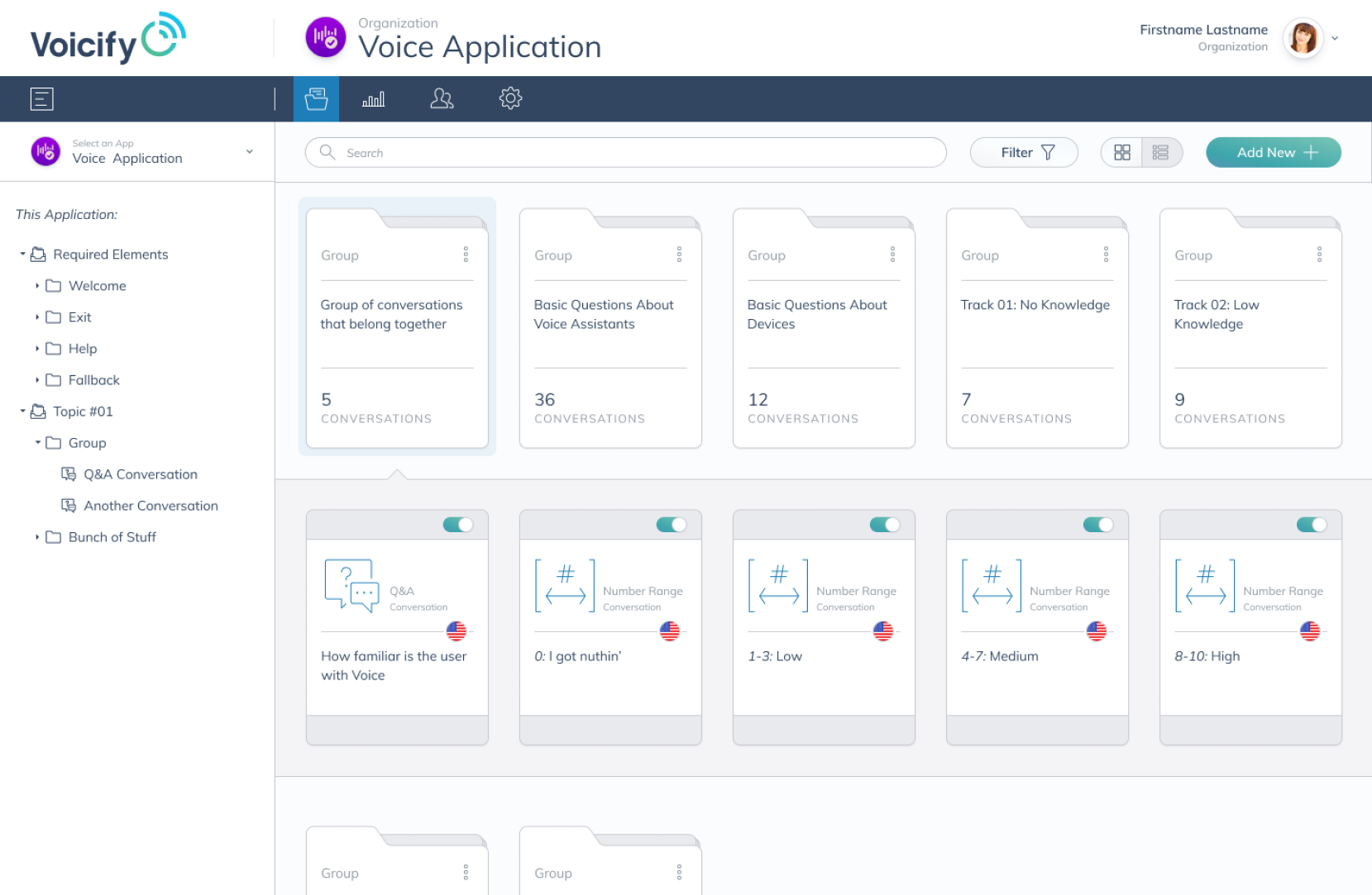
The new interface allowed content to be grouped into folders based on their relationship to one another. The users were now free to decide what pieces of content belonged together.
Additionally, I ended up restructuring the information architecture of the platform to better suit the revised content layout.
Process
RESEARCH
01
User Interviews
Competitive Analysis
Understand the Users
02
Key Takeaways
Motivations and Pain Points
Project Goals
DEFINE
03
IDEATE
Wireframing
Prototyping
04
VALIDATE
User Testing
Stakeholder Feedback
RESEARCH
01
User Interviews
In my career, I’ve found that some of the best insights come from speaking directly with users. To better understand their needs for this project, I set out to speak with 5 of our customers who regularly used the Voicify platform.
I really want an outline or overarching view

I took over this project and had a hard time finding the pieces [previous owner] put together
We organized our content via naming convention to keep track of related subjects
We largely used existing “pillars” to divide up by subject
We didn’t build these out as much as we could or should have
I didn’t realize how long it would take to add everything in
Where did I put that one phrase?
Competitive Analysis
Throughout my time at Voicify I maintained a comprehensive list of organizations within the conversational space and took note of their features, advantages, and challenges.
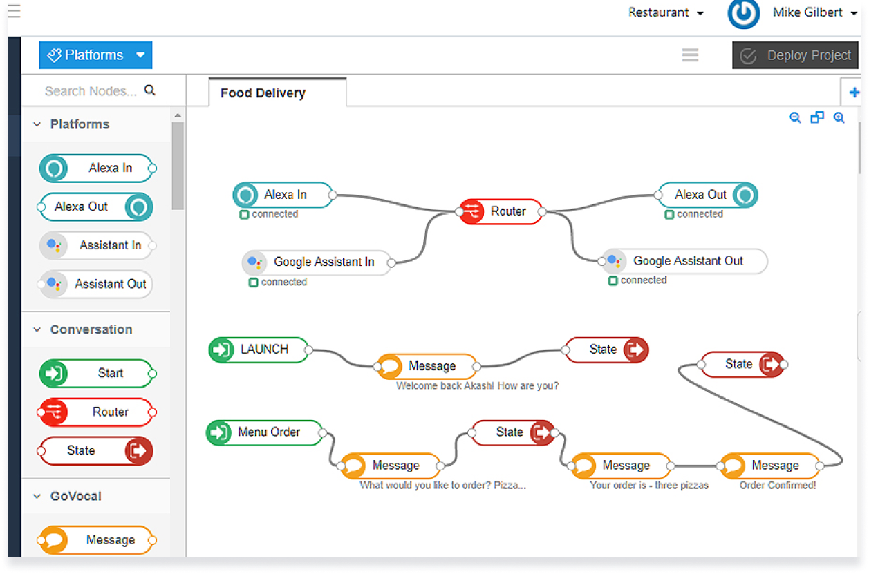
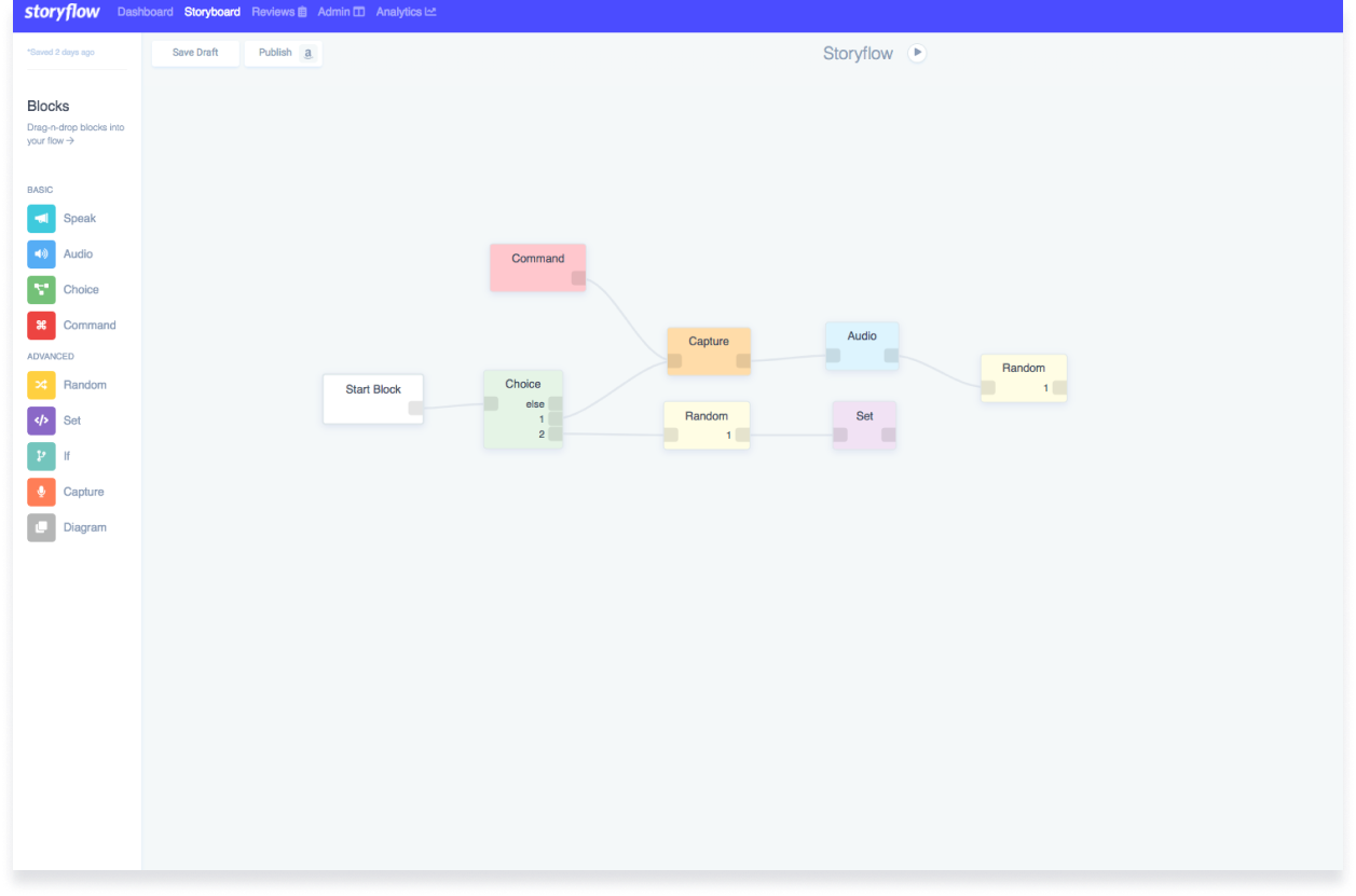
From the outset it was apparent that most platforms in this space relied on linear flows with nodes and arrows connecting them. Our differentiator was that our platform could easily accommodate open-ended conversations and not use such a rigid structure.

Better for presenting single-turn responses (i.e. a Question and Answer)
Little to no model-training required
Less overwhelming to new users

Voicify Platform Advantages
Harder to visualize an overview of the experience
Building out a complex flow could be cumbersome

Voicify Platform Disadvantages
Understanding the Users

This was the majority of our early customer base and reflected the desire for brands to enter the voice space to engage with their users. They often came from a marketing or customer care background and wanted to have a voice experience “that just worked.”
Marketing/Brand Representative

Some organizations had someone dedicated to building out their voice or conversational experience. This was still an emerging role so it was often the first time these individuals found themselves tasked with building out these experiences.
Conversation Designer

This category includes a smaller subset of our customer base who were using the Voicify platform for its ability to integrate into various systems. They had a more limited need for the presentation of content and relied more on APIs and webhooks to build their experiences.
Voice Developers
DEFINE
02
Key Takeaways & User Pain Points
With these insights, I set out to identify some of the goals and pain-points of our users to help create a better experience. Some patterns began to emerge:
Difficulty traversing content
Complex interactions required navigating to many different pages/levels and users could easily lose their place or find themselves unable to locate the item they were looking for.
Less robust experiences
Since multi-turn conversations was launched about 4 months prior, many of our customers had begun to test the new features but some were still reluctant to build out complex flows.
Organizational workarounds
Content organization relied on workarounds like naming convention or offline documentation
Limited purview
Users typically work on a single app at a time
Sidebar navigation
Many of our users were accustomed to using the sidebar to navigate their content

Project Goals
Better Content Management
Remove the “by-type” guardrails and allow content to be organized according to the users’ perspective
Facilitate Easier Content Traversal
Provide the necessary tools to allow customers to find specific content more quickly and easily
Improve Information Architecture
Restructure the platform to accommodate the redesigned approach to presenting content
* Provide an Overarching View of Content Connections
This was originally a goal of this project but after some early wireframing and consideration we had to postpone this aspect due to its complex nature and associated engineering costs
How might we view success?
Uptick in new contracts and renewals
More favorable customer perception of the platform
More engaging experiences being built (deliver value to our customers by enabling them to better interact with their audience)
IDEATE & VALIDATE
03 & 04
Explorations & Feedback
Early Stage
Sometimes small changes can accomplish the goals of a particular project. I wanted to explore this notion here and presented an option that would quickly move us in the right direction to enable the features we needed.
This interface did not perform as well as some of the others I tested, partly due to there potentially being too much content that would be displayed at once within the main column.
Within the team, we decided that the time was right for a more significant change to the platform.

Testing Layouts and Presentation
The concept of grouping content in this manner was well-received and there was a strong preference for using the term “folder” in copy.
I presented the content as a tabular, list view as well as a card style. The list view was favored due to the fact that it could show more data relevant to the content.
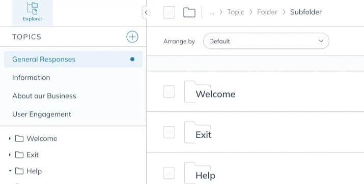
It seemed to be heading in the right direction but there were hierarchy issues with the layout. The solution was to move the nav items to the top. This also freed up that space for other relevant controls.
Feedback from one of our customers reinforced that a text description for each nav item would be helpful.
Even details about the content tree within the sidebar came to light when discussing these designs with customers. There was a preference for the collapsed folder view to be a right facing arrow rather than a downward-facing one or none at all.
Legacy Feature of Topics
Topics were the original top-level organizational structure in the platform. Here I explored the idea of having each topic be a separate workspace within the app. It would behave similar to “Pages” within Figma.
The alternative was to turn each existing topic into a top-level folder and there was some internal discussion about which approach would be best. I leaned towards keeping Topics as a concept but others felt it would be easier to transition to an all-folders approach.
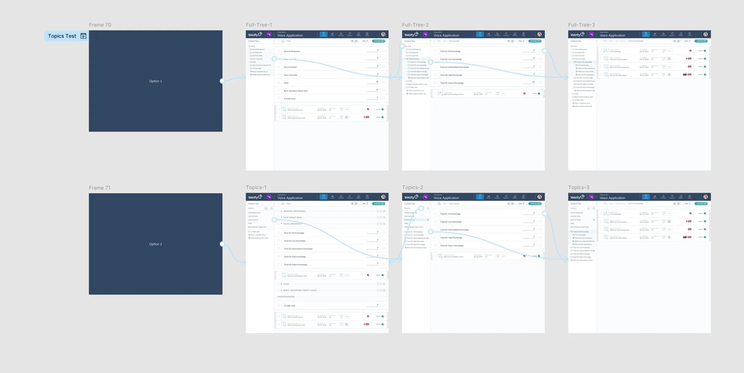
Gathering Data
To help resolve this, I did a quick survey of a handful of our more active customers and sought their input. I put together a quick prototype of each layout option and asked them to navigate around and vote on which felt more natural to them. The results convinced me that converting topics into high-level folders was more user-friendly and we moved forward with that approach.

Feature Refinement
During testing it became apparent that most apps had few items inside each folder. We ultimately decided against the arrange and paginate controls to save vertical space and reduce clutter.
Results
Impact

Customer Growth & Acquisition
The new CMS structure of the platform coincided with a push toward larger, enterprise-level customers. The new functionality, along with the new look and feel helped sell our platform as a true enterprise tool. Soon after the change we began to acquire larger organizations as customers, including several Fortune 500 companies.

Better Customer Satisfaction
Our team had regular check-ins with our customers and overall, they had really positive reactions to the changes. Most stated that the revisions to the platform had solved the problems they were having with organizing content.
CSAT Scores went from 71% to 82%

More Engaging Content
We saw better engagement from many of our users and the quality of the content they put out improved as well. In the following six months new end-users spent 43% more time using our customers’ experiences.